
Big Turn Music Festival
The Big Turn Music Fest is a 2 day city-wide event that builds community through music in historic downtown Red Wing, Minnesnowta.
Case Study
In 2016 my cousin approached me to build a brand from the ground up for a winter music festival that would take place in Red Wing, MN in the month of Febrrrruary. He had a name and a vision and over the next 6 years, the brand has been evolving & gaining traction both in followers & attendees.
Capacity:
•Brand Identity & Strategy
•Creative Director
•Graphics
•Copywriter
•Logo
Film and post production by Flight Creative Media – Creative/Art Direction by Adam Monro Brown

Competitive Analysis
As mentioned above, we had a name and a vision but how was this festival going to be different? What was going to make the BTMF brand stand out in a crowded festival space?
We started with the competitive analysis. We selected a handful of competitors to evaluate who (in our eyes and our target consumer’s eyes) were creating lasting impressions based off of their social following, social interactions and visual aesthetics. After diving into what these handful of competitors were doing right and wrong, we began crafting our differentiated brand tone-of-voice and visuals that would set us apart.
Our competitive edge came from this being a music festival that takes place in the dead of winter at multiple venues. Since most festivals take place in the summer, we knew we had an advantage but also a tough goal to get people to the festival since the Minnesnowta winters can be brutal. Luckily, most adventurous people are usually stir crazy in the midwest by Febrrrruary so we felt if we built it, they would come.

Envisioning the Brand
With the analysis of the market collected, next step was honing in on our brand voice, positioning, personality & archetype.
The voice had to feel genuine but also unique. The personality has to intrigue you enough for you to strap on your boots, travel to a unique city and brave the outdoors while you’re transitioning from venue to venue in the dead of winter. This is because the “venues” are different businesses around town that open their doors for the weekend.
It was only logical then that we would go with the “Explorer” archetype. By using the explorer as our underlying brand archetype, the messaging was crafted to give the essence of enjoying freedom, adventure and discovery.

Logo
The logo needed to resemble all the aspects that represent the festival – exploration, discovery, and community. The name “Big Turn” is a reference to the sharp bend the Mississippi river takes as it flows through Red Wing Minnesota.

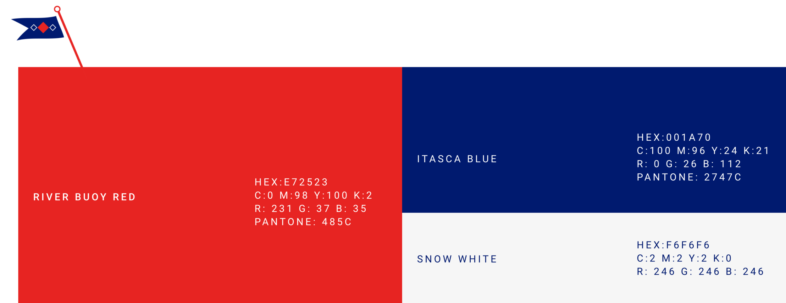
Color Scheme
Chosen to quickly communicate volume, excitement and exploration.
Typography
Music speaks to us, so the brand needed to reflect this conversation by utilizing strong, stylized typographic treatments. The typefaces work together but can convey different tones.

Supporting Visual Elements
Since typography is the main graphical language of the brand, simple and welcoming illustration was created.


